Digital acquisition journey redesign

Vodafone・Responsive web・2019
Overview
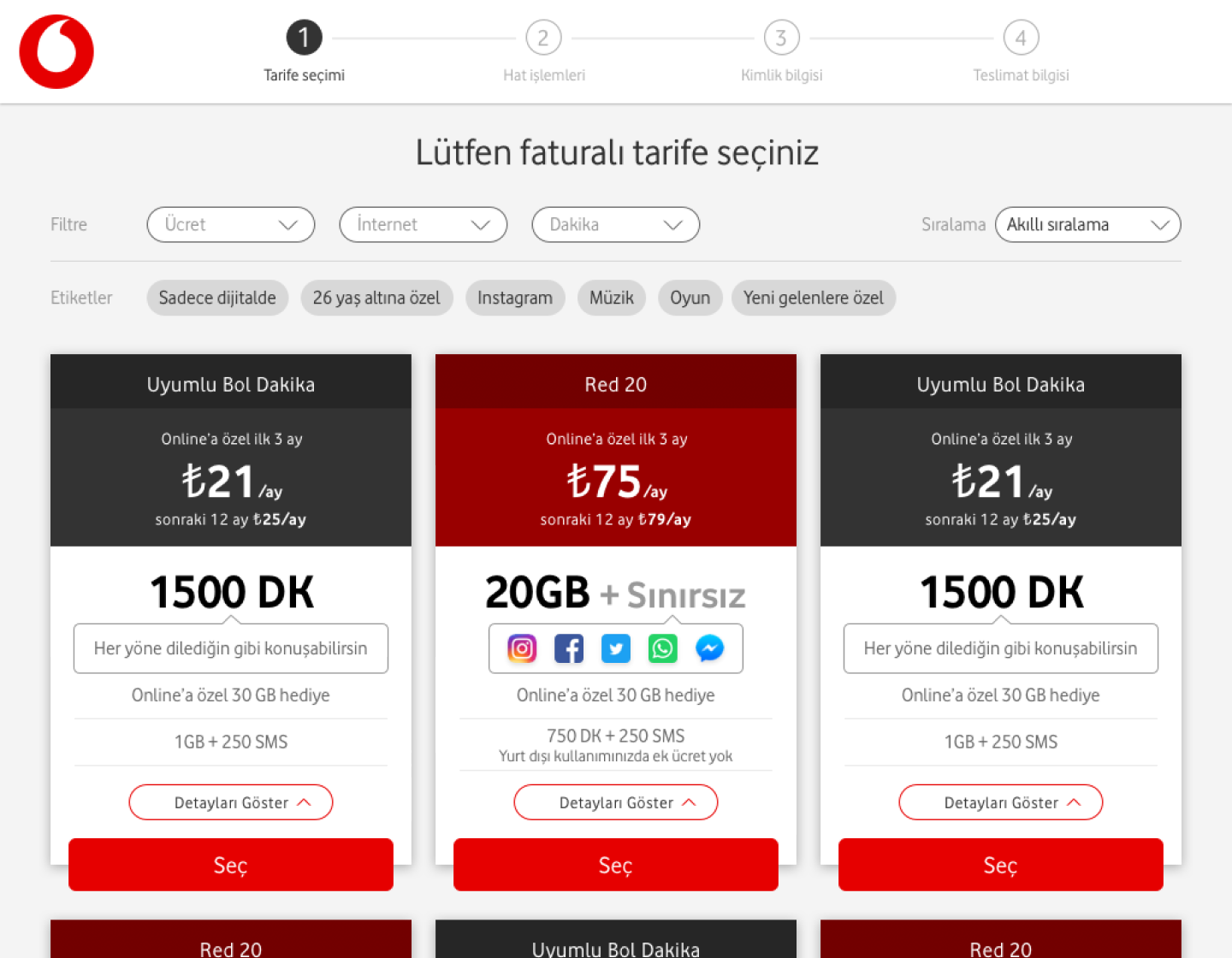
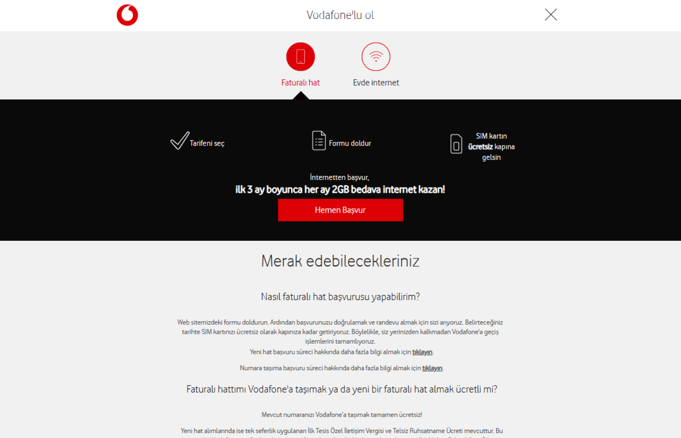
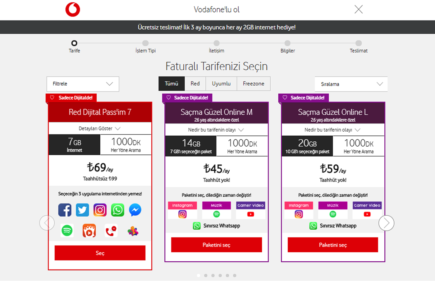
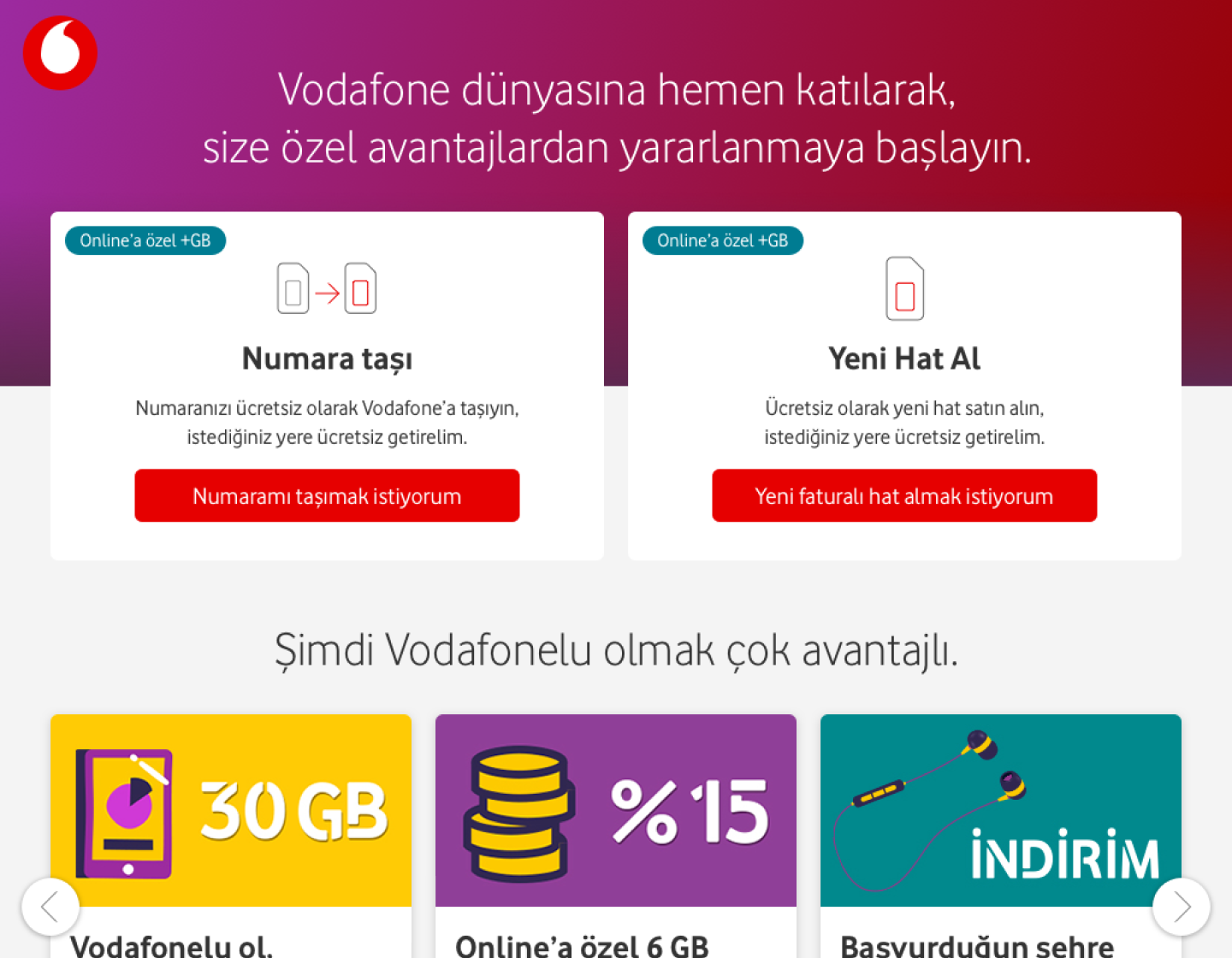
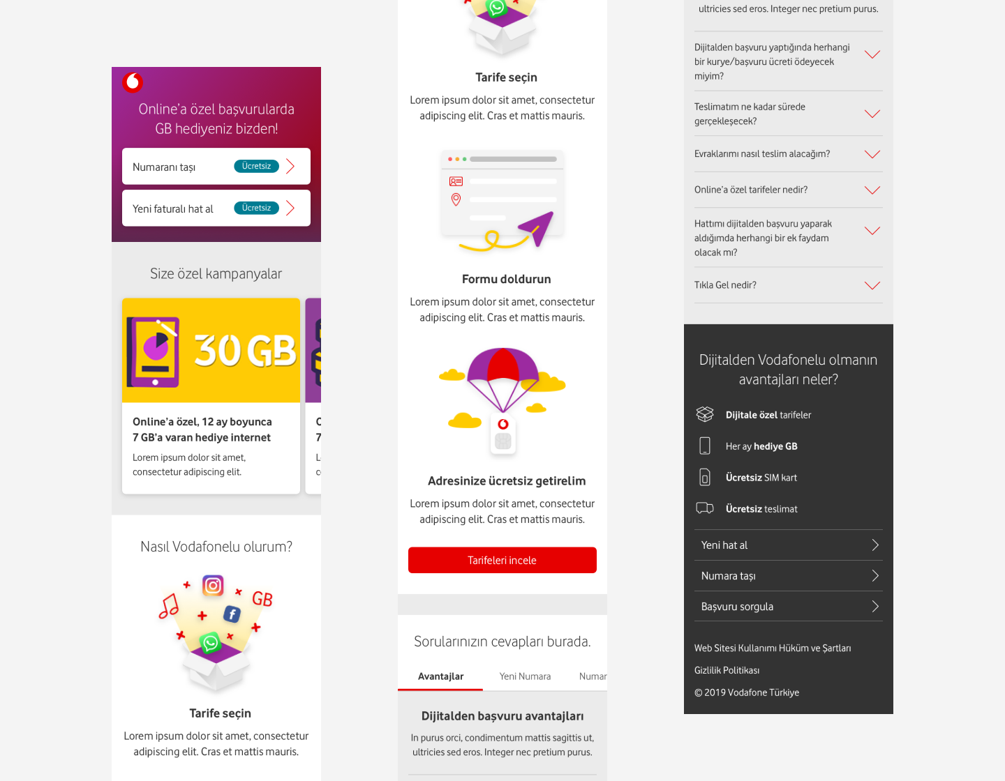
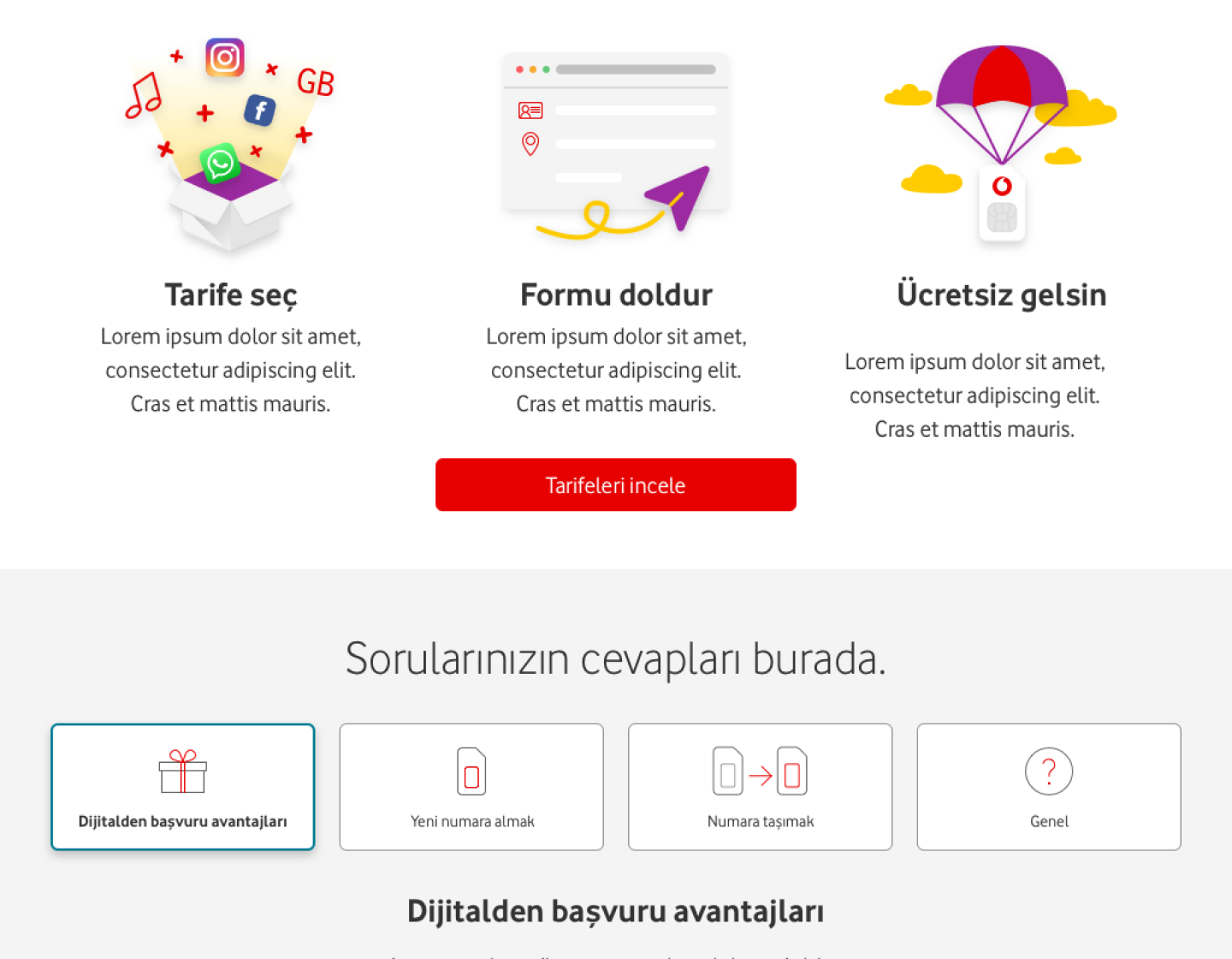
This project focused on improving Vodafone’s digital acquisition journey for buying a SIM card or applying for home internet. The aim was to make the starting point clearer, simplify the first decisions, and present tariffs in a more structured and easy-to-compare way.
Company
Vodafone Turkey HQ
My Role
Lead UX designer
Journey analysis・Heuristic evaluation・Flow restructuring・UI design・Design library ownership
Results
273% increase in unique visitors
248% increase in collected leads
212% increase in digital share
286% increase in digital gross additions

Challenge

Users entered the journey from a single CTA on Vodafone.com.tr and landed on a page with two tabs—SIM card and home internet. The SIM tab was pre-selected, and users had to begin the application before choosing whether to migrate their number or apply for a new SIM. This late decision point caused confusion and contributed to drop-offs.

Funnel data and a heuristic evaluation confirmed this problem and also showed issues in tariff comparison and visibility. The slider hid several tariffs, card heights were inconsistent, and key details were not presented in a clear hierarchy.

Old experience

The previous journey started with a tabbed layout for SIM card and home internet, and the SIM option was pre-selected. Users had to enter the flow before deciding whether to migrate their number or apply for a new SIM, which caused confusion early in the process. Tariffs were shown in a slider with inconsistent card heights, making comparison difficult and limiting the visibility of several options.

Improvements

  • Added two separate CTAs on Vodafone.com.tr: one for SIM card, one for home internet
  • Directed users to dedicated landing pages instead of a single tabbed page
  • Introduced two clear entry points on the SIM landing page: Migrate your number and Apply for a new SIM card
  • Added a campaign area and a simple step-by-step explanation of the process
  • Grouped help content into clear categories
  • Redesigned tariff cards with fixed height and stronger hierarchy; added filtering chips powered by backend tags (e.g., Instagram, youth, campaign plans); removed the slider for full visibility

New experience

Users who select the SIM card CTA on Vodafone.com.tr now land on a dedicated page with two clear options: migrating an existing number or applying for a new SIM card. The mobile and desktop layouts follow the same structure and hierarchy. The tariff selection page now presents standardized cards without a slider, and filtering chips help users narrow down options quickly.

Other earlier works

My Vodafone app

Vodafone・Mobile app

Banking UX and UI Projects

Garanti BBVA・Mobile & Web apps

CEPTETEB digital banking app

TEB・Mobile app