Results
20% increase in success rate
18% decrease in error cases
Context
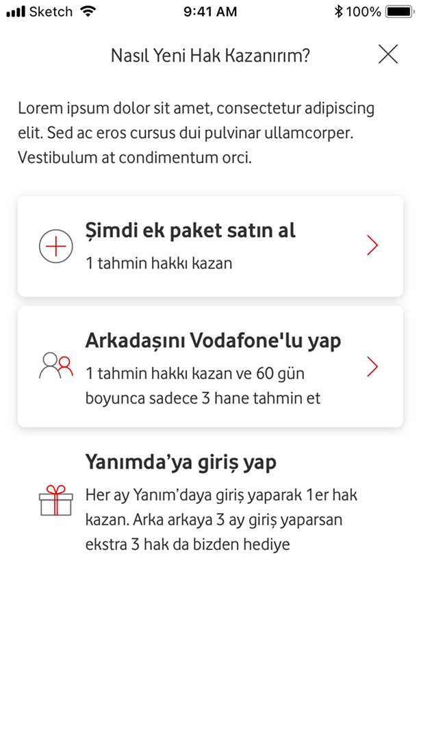
The prepaid top-up flow needed improvements to shorten the journey and increase the success rate. Usability tests on the old design revealed several issues: users struggled to find how to top up another number, had difficulty recalling numbers, faced unclear amount selection, misinterpreted the save-card option, could not switch between saved and new cards, and encountered unclear error states.
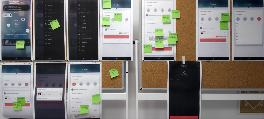
User insights and workshop
Usability tests on the old design revealed several issues: users struggled to find how to top up another number, had difficulty recalling numbers, faced unclear amount selection, misinterpreted the save-card option, could not switch between saved and new cards, and encountered unclear error states.
A one day UX workshop was held with the research team to review these findings, map the problem areas, and explore improvements and new feature options for the redesigned journey.
Design improvements
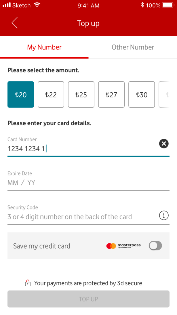
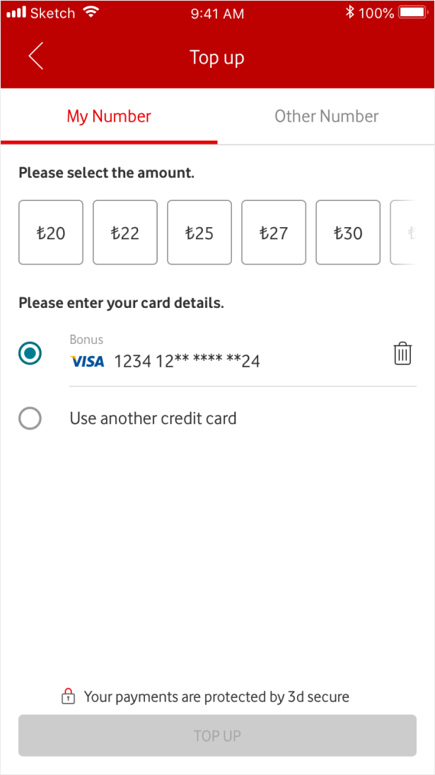
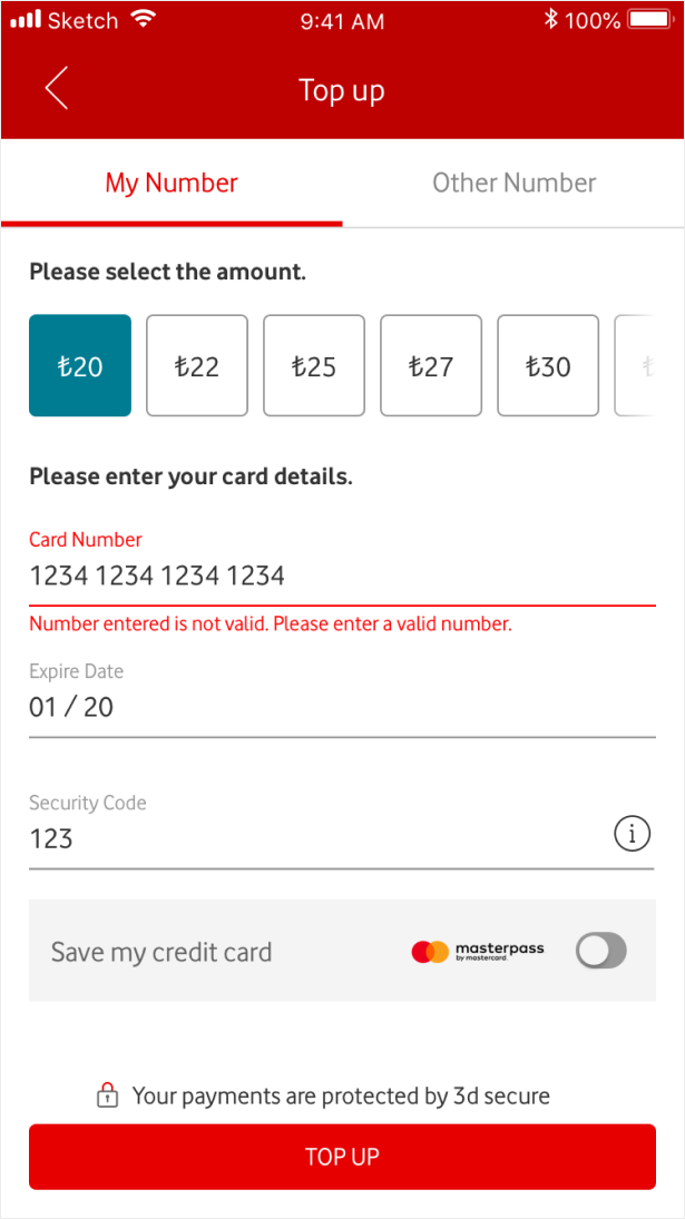
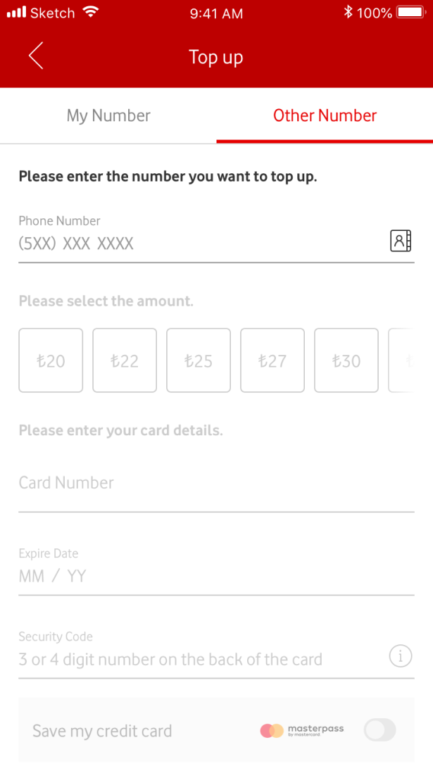
The flow was separated into “Top up to my number” and “Top up to other number”. Optional predefined amounts were placed in a horizontal swipe for easier scanning. The security code field became more informative with a ghost text and an info button.
The save-card component was redesigned with clear text and a switch control. When users had saved cards, switching between saved and new cards became explicit with radio buttons. Backend updates improved focus behavior, inactive confirmation states until inputs were completed, and selecting numbers from the contact list.
Guideline update
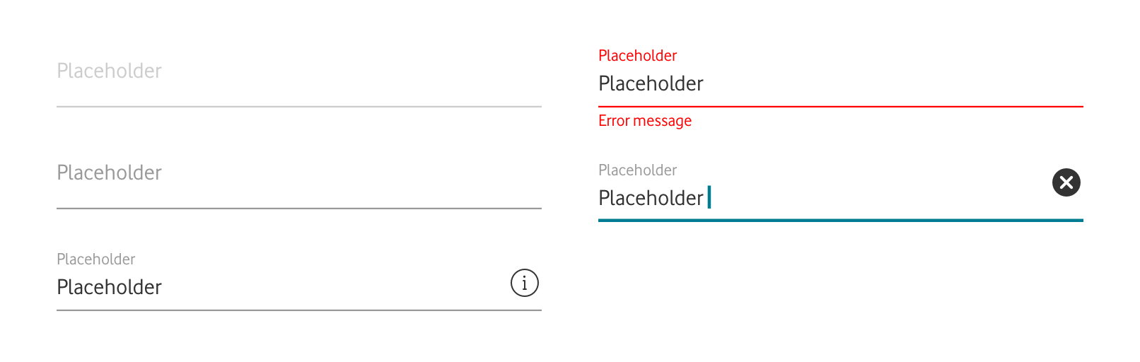
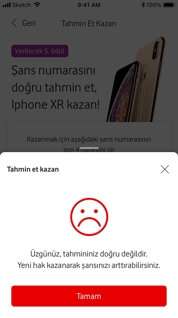
Error states and focus behaviors were redefined as an MVP guideline for the app to improve consistency.