CEPTETEB mobile banking app

Türk Ekonomi Bankası (TEB)・Mobile app・2017
Overview
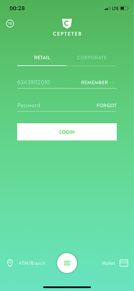
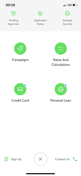
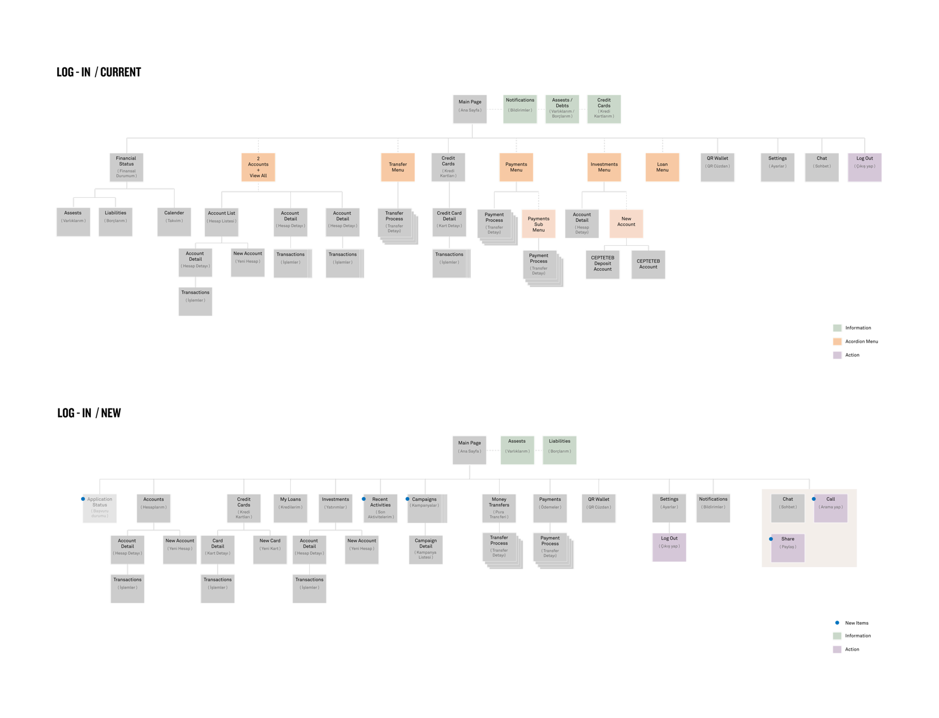
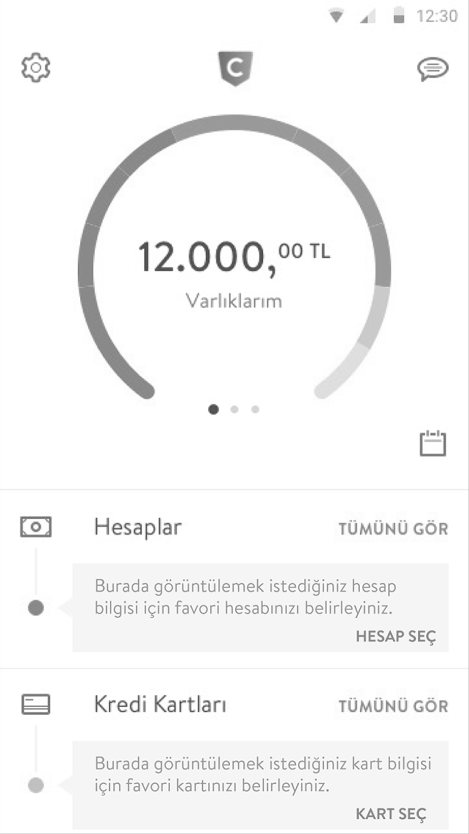
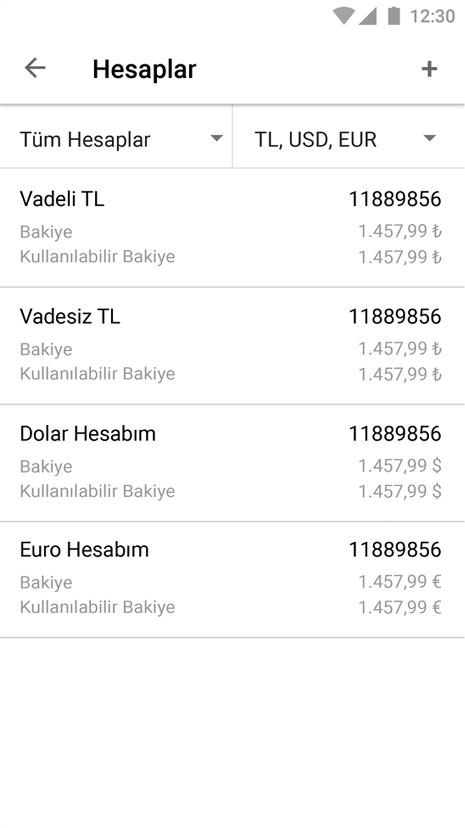
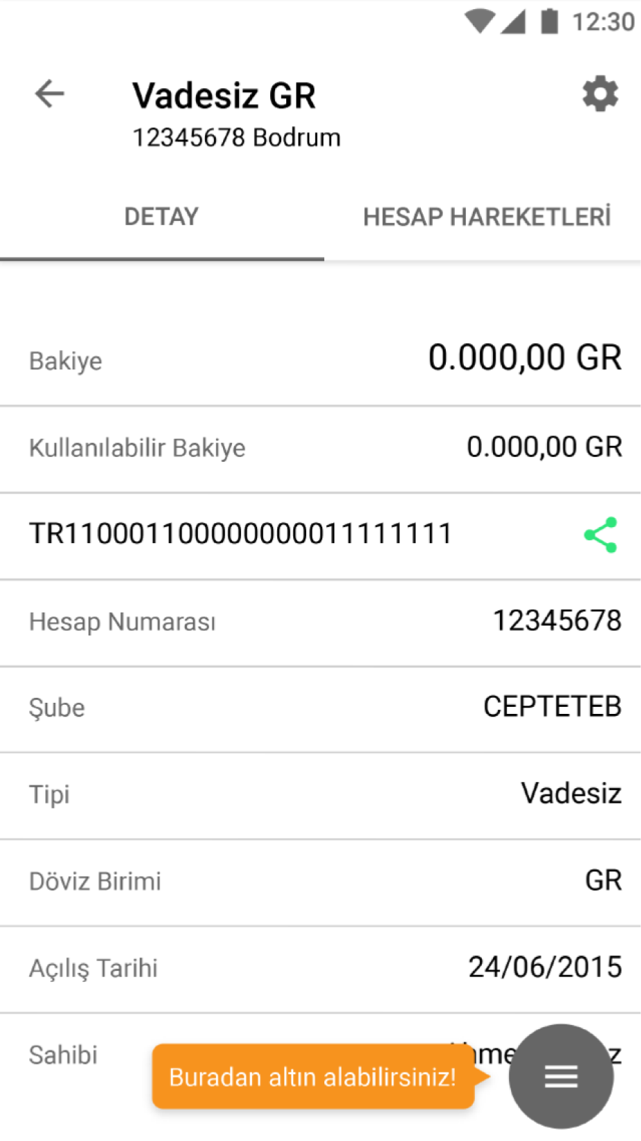
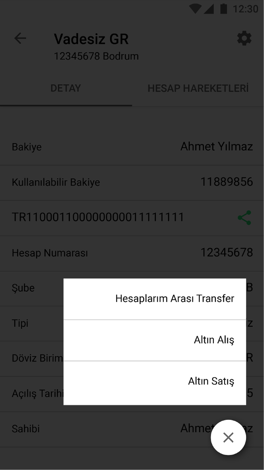
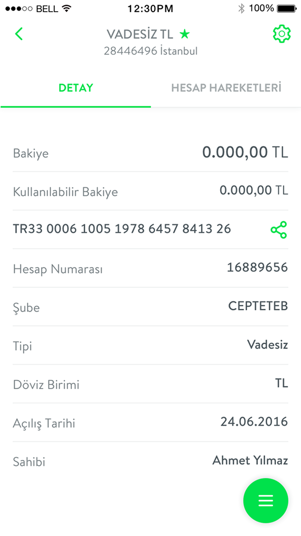
CEPTETEB is one of Turkey’s leading digital banking products. This project involved a full redesign of the mobile banking application. The information architecture was rebuilt, core banking journeys were restructured, and the interaction model was modernized. All major flows were revisited to reduce friction and surface key actions more clearly.
Agency
I-AM Istanbul
My Role
UX Designer (Core contributor)
Information architecture · Flow design · Wireframes · UX refinement · UI support
Results
525,000+ customers
1,000,000+ downloads
Best Mobile App – Banking & Finance, 16th Altın Örümcek Awards
Most Accessible Mobile App – 16th Altın Örümcek Awards

Challenge

The previous CEPTETEB mobile app suffered from deep navigation hierarchies, unclear information groupings and inconsistent screen templates. Key actions were often hidden, and multiple journeys required unnecessary steps. Visual patterns were outdated and fragmented across the product. The main challenge was to reorganize the entire structure, redesign core flows and introduce a consistent interaction and visual system without disrupting the existing customer base.

Analysis & site map

The entire app structure was evaluated, including view and click data, transaction performance, navigation behavior and feature usage. Multiple issues were identified across the old architecture: deep hierarchies, hidden or duplicated actions, unclear naming and inconsistent screen templates.A new site map was created for the full application. Content groups were reorganized, redundant branches were removed, and new sections such as recent activities and campaigns were added to improve discoverability.

Designing the wireframes

All major flows were redesigned end to end. A new action bar was introduced on the home screen to surface frequent tasks such as payments and money transfers. Product detail pages gained floating action buttons to expose key actions. Information hierarchy, spacing and scannability were reworked across account views, lists and transaction screens.

New interaction patterns including sticky headers, expandable blocks and cleaner overlays were defined for consistency.

Designing the interface

The previous visual style lacked consistency and no longer reflected a modern banking product. All UI components were redesigned using a cleaner, Material-inspired system. Iconography, buttons and forms became more structured. Colors and spacing were balanced to support a more contemporary and accessible interface. A complete design guideline and updated asset library were delivered at the end of the project.

Visual design

A visual workshop was organized with stakeholders to define the new login background concept. Selected visuals were developed into three stylistic directions and delivered as alternative background sets.

Other earlier works

Insurance customer app

Allianz・Mobile app

Digital acquisition journey redesign

Vodafone・Responsive web

My Vodafone app

Vodafone・Mobile app